
Practice: Chp. 7#
source("iplot.R")
suppressPackageStartupMessages(library(rethinking))
7E1. State the three motivating criteria that define information entropy. Try to express each in your own words.
Answer.
The change in an uncertainty metric (entropy) should be continuous as the distribution probabilities change continuously.
An uncertainty metric should increase as the number of events increases. For example, we intuitively expect more uncertainty from a roll of a die than from flipping a coin.
Our uncertainty metric (or information metric) should increase additively when two distributions are combined.
See also Entropy (information theory) - Alternate characterization and Information content.
7E2. Suppose a coin is weighted such that, when it is tossed and lands on a table, it comes up heads 70% of the time. What is the entropy of this coin?
Answer. In nats:
p <- c(0.7, 0.3)
display(-sum(p * log(p)))
7E3. Suppose a four-sided die is loaded such that, when tossed onto a table, it shows “1” 20%, “2” 25%, ”3” 25%, and ”4” 30% of the time. What is the entropy of this die?
Answer. In nats:
p <- c(0.2, 0.25, 0.25, 0.30)
display(-sum(p * log(p)))
7E4. Suppose another four-sided die is loaded such that it never shows “4”. The other three sides show equally often. What is the entropy of this die?
Answer. In nats:
p <- c(1 / 3, 1 / 3, 1 / 3)
display(-sum(p * log(p)))
ERROR: The medium questions are marked as easy (e.g. 7M1 below is marked 7E1) in VitalSource.
7M1. Write down and compare the definitions of AIC and WAIC. Which of these criteria is most general? Which assumptions are required to transform the more general criterion into a less general one?
Answer. The formulas:
WAIC is more general; we can transform it into AIC if we assume the penalty term i.e. effective number of parameters is equal p.
7M2. Explain the difference between model selection and model comparison. What information is lost under model selection?
Answer. In model selection, we lose information about the relative confidence we have in a model to other models we’ve evaluated. The model with the best PSIS or WAIC score (best predictive score) is not necessarily the one we want; we may be able to give up predictive accuracy for a model we believe is causally correct if the difference in predictive accuracy is negligible.
A related consideration is that as we consider more models, we’ll likely discover one (see the section on the ‘The Curse of Tippecanoe’) that will fit the data well only because we’ve tried so many models.
7M3. When comparing models with an information criterion, why must all models be fit to exactly the same observations? What would happen to the information criterion values, if the models were fit to different numbers of observations? Perform some experiments, if you are not sure.
Answer. WAIC and AIC are based on lppd (log-pointwise-predictive-density) which is based on
the idea of a log-probability score. Both lppd and the log-probability score are based on the
number of observations; they will scale with the number of observations. The log-probability score
is an estimate of \(E[log(q_i)]\) but:
without the final step of dividing by the number of observations
The first of these experiments is fit to 50 observations; the second is fit to 40 observations:
set.seed(214)
data(cars)

cm1 <- quap(
  alist(
    dist ~ dnorm(mu, sigma),
    mu <- a + b * speed,
    a ~ dnorm(0, 100),
    b ~ dnorm(0, 10),
    sigma ~ dexp(1)
  ),
  data = cars
)

fewer_obs <- cars[1:40, ]
cm2 <- quap(
  alist(
    dist ~ dnorm(mu, sigma),
    mu <- a + b * speed,
    a ~ dnorm(0, 100),
    b ~ dnorm(0, 10),
    sigma ~ dexp(1)
  ),
  data = fewer_obs
)
display(WAIC(cm1))
display(WAIC(cm2))
| WAIC | lppd | penalty | std_err |
|---|---|---|---|
| <dbl> | <dbl> | <dbl> | <dbl> |
| 422.9711 | -206.8925 | 4.59299 | 17.50602 |
| WAIC | lppd | penalty | std_err |
|---|---|---|---|
| <dbl> | <dbl> | <dbl> | <dbl> |
| 336.5567 | -163.244 | 5.034332 | 17.65673 |
source("practice-overfitting-underfitting.R")
7M4. What happens to the effective number of parameters, as measured by PSIS or WAIC, as a prior becomes more concentrated? Why? Perform some experiments, if you are not sure.
ERROR: There is no ‘effective number of parameters’ associated with PSIS. Also, section 7.4.2 recommends using the term ‘overfitting penalty’ rather than ‘effective number of parameters’, which exists for historical reasons.
Answer. An informative prior will reduce the effect of the sample on the posterior, but will in general lead to a posterior that is more concentrated (like the prior). A more concentrated posterior will lead to lower variance, decreasing the penalty term.
The first of these experiments has vague priors; the second has informative priors:
| WAIC | lppd | penalty | std_err |
|---|---|---|---|
| <dbl> | <dbl> | <dbl> | <dbl> |
| 423.1567 | -206.9437 | 4.634659 | 17.67979 |
| WAIC | lppd | penalty | std_err |
|---|---|---|---|
| <dbl> | <dbl> | <dbl> | <dbl> |
| 421.7469 | -206.8957 | 3.977765 | 17.35248 |
7M5. Provide an informal explanation of why informative priors reduce overfitting.
Answer. An informative prior reduces the influence of the sample on the posterior; the influence of the sample is what causes overfitting.
See also Prior Choice Recommendations.
7M6. Provide an informal explanation of why overly informative priors result in underfitting.
Answer. An overly informative prior is overly skeptical; it claims to know more about the problem at hand than the data does.
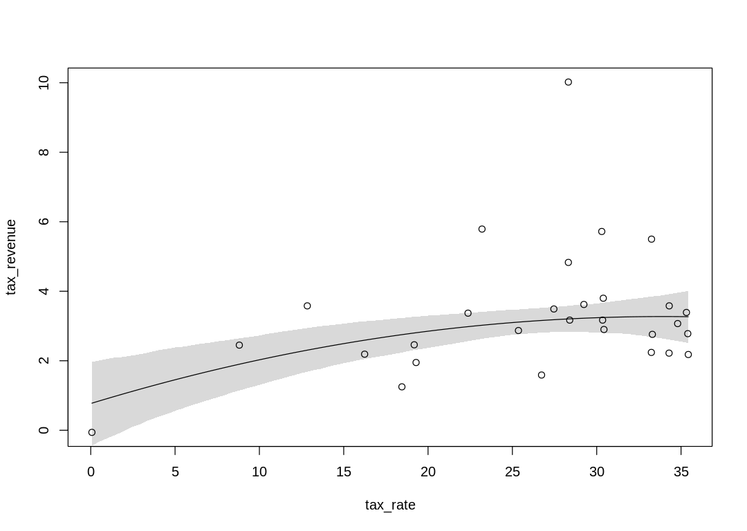
7H1. In 2007, The Wall Street Journal published an editorial (“We’re Number One, Alas”) with a
graph of corporate tax rates in 29 countries plotted against tax revenue. A badly fit curve was
drawn in (reconstructed at right), seemingly by hand, to make the argument that the relationship
between tax rate and tax revenue increases and then declines, such that higher tax rates can
actually produce less tax revenue. I want you to actually fit a curve to these data, found in
data(Laffer). Consider models that use tax rate to predict tax revenue. Compare, using WAIC or
PSIS, a straight-line model to any curved models you like. What do you conclude about the
relationship between tax rate and tax revenue?
Answer.
Related articles:
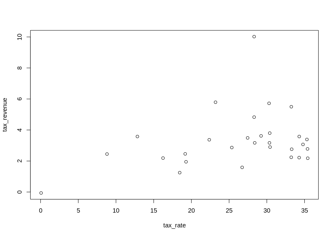
The raw data “unbiased” by a line or curve:
A straight line model:
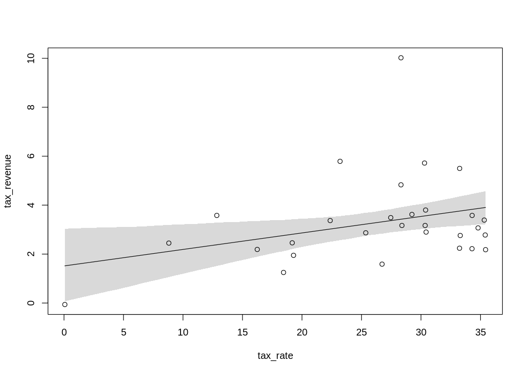
| WAIC | lppd | penalty | std_err |
|---|---|---|---|
| <dbl> | <dbl> | <dbl> | <dbl> |
| 126.3563 | -55.77271 | 7.405427 | 24.62695 |
Some Pareto k values are very high (>1). Set pointwise=TRUE to inspect individual points.
| PSIS | lppd | penalty | std_err |
|---|---|---|---|
| <dbl> | <dbl> | <dbl> | <dbl> |
| 129.3381 | -64.66905 | 8.948094 | 28.12313 |
A curved (second order polynomial) model:
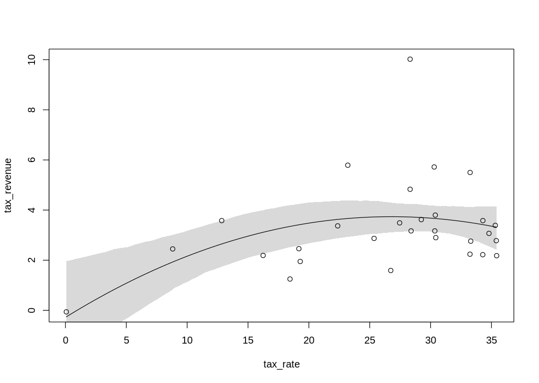
| WAIC | lppd | penalty | std_err |
|---|---|---|---|
| <dbl> | <dbl> | <dbl> | <dbl> |
| 124.3001 | -54.61749 | 7.532548 | 24.30445 |
Some Pareto k values are very high (>1). Set pointwise=TRUE to inspect individual points.
| PSIS | lppd | penalty | std_err |
|---|---|---|---|
| <dbl> | <dbl> | <dbl> | <dbl> |
| 133.3607 | -66.68033 | 12.11654 | 33.6933 |
The curved model appears to be a better fit. The difference in WAIC between the two models is significant but not definitive.
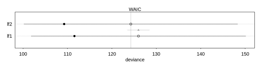
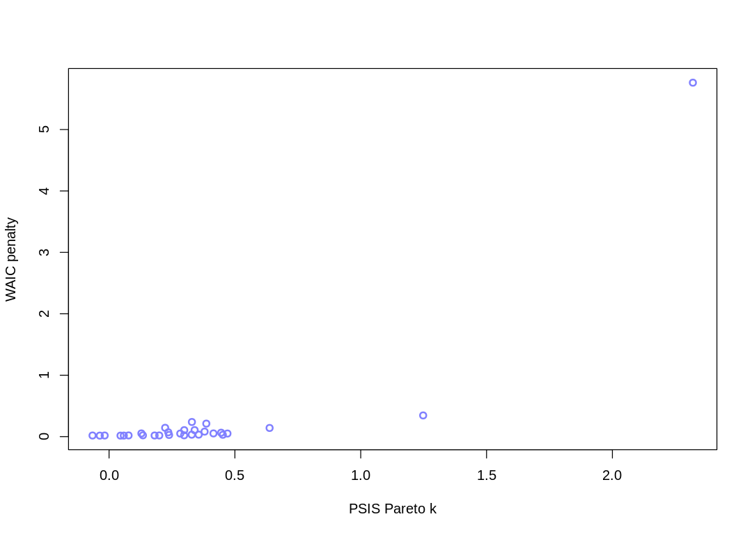
7H2. In the Laffer data, there is one country with a high tax revenue that is an outlier. Use PSIS and WAIC to measure the importance of this outlier in the models you fit in the previous problem. Then use robust regression with a Student’s t distribution to revisit the curve fitting problem. How much does a curved relationship depend upon the outlier point?
Answer. There are two major outliers:
Some Pareto k values are very high (>1). Set pointwise=TRUE to inspect individual points.
The curved relationship flattens when this prior is adjusted:
7H3. Consider three fictional Polynesian islands. On each there is a Royal Ornithologist charged by the king with surveying the bird population. They have each found the following proportions of 5 important bird species:
Species A |
Species B |
Species C |
Species D |
Species E |
|
|---|---|---|---|---|---|
Island 1 |
0.2 |
0.2 |
0.2 |
0.2 |
0.2 |
Island 2 |
0.8 |
0.1 |
0.05 |
0.025 |
0.025 |
Island 3 |
0.05 |
0.15 |
0.7 |
0.05 |
0.05 |
Notice that each row sums to 1, all the birds. This problem has two parts. It is not computationally complicated. But it is conceptually tricky. First, compute the entropy of each island’s bird distribution. Interpret these entropy values. Second, use each island’s bird distribution to predict the other two. This means to compute the K-L Divergence of each island from the others, treating each island as if it were a statistical model of the other islands. You should end up with 6 different K-L Divergence values. Which island predicts the others best? Why?
Answer. Entropies in nats:
i1 <- c(0.2, 0.2, 0.2, 0.2, 0.2)
i2 <- c(0.8, 0.1, 0.05, 0.025, 0.025)
i3 <- c(0.05, 0.15, 0.7, 0.05, 0.05)
entropy <- function(pdf) {
  return(-sum(pdf * log(pdf)))
}
islands <- list(i1, i2, i3)
entropies <- lapply(islands, FUN = entropy)
names(entropies) <- c("island1", "island2", "island3")
display(entropies)
- $island1
- 1.6094379124341
- $island2
- 0.743003936734169
- $island3
- 0.983600299523093
If you’re on island 1, it’s hard to guess what a random bird is going to be because they are all nearly equally likely (there is a lot of uncertainty). If you’re on island 2, on the other hand, if you guess species A you’re likely to be right.
K-L Divergences in nats, including how each species contributes to the sum:
nat_div <- function(pdf_p, pdf_q) {
  return(pdf_p * log(pdf_p / pdf_q))
}
# Partial permutations of islands
perm <- data.frame(island_p = c(1, 1, 2, 2, 3, 3), island_q = c(2, 3, 1, 3, 1, 2))
div <- t(mapply(function(p, q) nat_div(islands[[p]], islands[[q]]), perm$island_p, perm$island_q))
colnames(div) <- paste("div_species_", LETTERS[1:5], sep = "")
nat_kl_div <- rowSums(div)
display(cbind(perm, div, nat_kl_div))
| island_p | island_q | div_species_A | div_species_B | div_species_C | div_species_D | div_species_E | nat_kl_div |
|---|---|---|---|---|---|---|---|
| <dbl> | <dbl> | <dbl> | <dbl> | <dbl> | <dbl> | <dbl> | <dbl> |
| 1 | 2 | -0.27725887 | 0.13862944 | 0.27725887 | 0.41588831 | 0.41588831 | 0.9704061 |
| 1 | 3 | 0.27725887 | 0.05753641 | -0.25055259 | 0.27725887 | 0.27725887 | 0.6387604 |
| 2 | 1 | 1.10903549 | -0.06931472 | -0.06931472 | -0.05198604 | -0.05198604 | 0.8664340 |
| 2 | 3 | 2.21807098 | -0.04054651 | -0.13195287 | -0.01732868 | -0.01732868 | 2.0109142 |
| 3 | 1 | -0.06931472 | -0.04315231 | 0.87693408 | -0.06931472 | -0.06931472 | 0.6258376 |
| 3 | 2 | -0.13862944 | 0.06081977 | 1.84734013 | 0.03465736 | 0.03465736 | 1.8388452 |
K-L Divergences in bits, including how each species contributes to the sum:
bit_div <- div / log(2)
bit_kl_div <- rowSums(bit_div)
display(cbind(perm, bit_div, bit_kl_div))
| island_p | island_q | div_species_A | div_species_B | div_species_C | div_species_D | div_species_E | bit_kl_div |
|---|---|---|---|---|---|---|---|
| <dbl> | <dbl> | <dbl> | <dbl> | <dbl> | <dbl> | <dbl> | <dbl> |
| 1 | 2 | -0.4 | 0.20000000 | 0.4000000 | 0.600 | 0.600 | 1.4000000 |
| 1 | 3 | 0.4 | 0.08300750 | -0.3614710 | 0.400 | 0.400 | 0.9215365 |
| 2 | 1 | 1.6 | -0.10000000 | -0.1000000 | -0.075 | -0.075 | 1.2500000 |
| 2 | 3 | 3.2 | -0.05849625 | -0.1903677 | -0.025 | -0.025 | 2.9011360 |
| 3 | 1 | -0.1 | -0.06225562 | 1.2651484 | -0.100 | -0.100 | 0.9028928 |
| 3 | 2 | -0.2 | 0.08774438 | 2.6651484 | 0.050 | 0.050 | 2.6528928 |
Let’s interpret the first row. If you’re from island 2 (where species A is common) and you go to island 1 but continue to guess bird species based on priors from your home island, you’re going to be surprised quite a bit. The biggest contributors to the additional surprisal you’ll experience will be species D and E, which are now 8x more common than what you’re used to. Because log2(8) is three, this additional surprisal (in bits) is \(0.2·3 = 0.6\).
In the second row, you’re from island 3 and visiting island 1. Your priors aren’t as extreme as island 2’s so your overall KL divergence is lower.
In the third row, you’re from island 1 and visiting island 2. You’re from a high entropy island so in general nothing surprises you much, but species A is common on your new island so you’re constantly surprised by seeing them since they’re somewhat rare on your island.
In the fourth row, you’re from island 3 and visiting island 2. You’re incredibly surprised by seeing species A everywhere, because they’re quite rare on your island. The sixth row is the reversed situation, but with slightly less surprisal because species C is less common on island 3 than species A is on island 2.
The least surprisal occurs in the fifth row, when you’re from island 1 and visiting island 3. You’re from a high entropy island so you aren’t shocked by anything, and the surprisal you experience by seeing species C everywhere is slightly less than if you were visiting island 2 coming from island 1.
7H4. Recall the marriage, age, and happiness collider bias example from Chapter 6. Run models m6.9 and m6.10 again. Compare these two models using WAIC (or LOO, they will produce identical results). Which model is expected to make better predictions? Which model provides the correct causal inference about the influence of age on happiness? Can you explain why the answers to these two questions disagree?
Answer. The first model performs better on WAIC and PSIS (better predictive performance), despite the fact the second provides the correct causal inference:
source("load-marriage-collider-models.R")
iplot(function() plot(compare(m6.9, m6.10)), ar = 4.5)
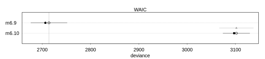
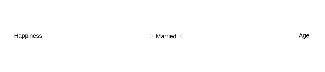
The answer to these two questions disagree because the predictive ability of a model is not necessarily related to whether it is confounded. In this case being confounded helps the model make a better prediction because understanding whether someone is married provides more direct information about whether they are happy than how old they are:
library(dagitty)
dag_hma <- dagitty('
dag {
    bb="0,0,1,1"
    Happiness [pos="0.1,0.2"]
    Married [pos="0.3,0.2"]
    Age [pos="0.5,0.2"]
    Age -> Married
    Happiness -> Married
}')
iplot(function() plot(dag_hma), ar=4.5)
7H5. Revisit the urban fox data, data(foxes), from the previous chapter’s practice problems.
Use WAIC or PSIS based model comparison on five different models, each using weight as the outcome,
and containing these sets of predictor variables:
avgfood + groupsize + area
avgfood + groupsize
groupsize + area
avgfood
area
Can you explain the relative differences in WAIC scores, using the fox DAG from last week’s
homework? Be sure to pay attention to the standard error of the score differences (dSE).
source("load-fox-models.R")
iplot(function() {
  plot(compare(
    mfox_Weight_AvgfoodGroupsizeArea,
    mfox_Weight_AvgfoodGroupsize,
    mfox_Weight_GroupsizeArea,
    mfox_Weight_Avgfood,
    mfox_Weight_Area
  ))
}, ar = 3)
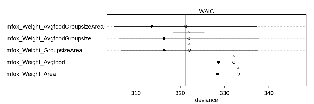
Answer. Recall the fox DAG:
iplot(function() plot(dag_foxes), scale=10)
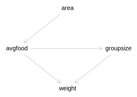
Both avgfood and groupsize directly affect weight, so they are the most important predictors to have
in the model. The first three models have both of these predictors, the first two directly, and the
third indirectly by getting avgfood through area. These three models perform the best, and the
standard error of their score differences (dSE) indicate it is difficult to distinguish their
performance.
The fourth and fifth models do not perform as well because they can only predict the impact of groupsize on weight indirectly through avgfood.