Practice: Chp. 8#
source("iplot.R")
suppressPackageStartupMessages(library(rethinking))
8E1. For each of the causal relationships below, name a hypothetical third variable that would lead to an interaction effect.
Bread dough rises because of yeast.
Education leads to a higher income.
Gasoline makes a car go.
Answer. For 1, let’s say the bread dough rises based on both yeast and temperature. If it’s way too hot or cold the bread won’t rise because of the yeast, and it will likely slow at less extreme temperatures.
For 2, consider location. Although income should rise with education, the rate at which it rises will depend on the location e.g. based on the cost of living. Another variable that would work is the category of the degree (medicine, engineering, art, language).
Interpret ‘go’ in 3 to mean the distance the car can travel. The kilometers traveled per liter will depend on the car model (e.g. treat the model as a categorical variable).
8E2. Which of the following explanations invokes an interaction?
Caramelizing onions requires cooking over low heat and making sure the onions do not dry out.
A car will go faster when it has more cylinders or when it has a better fuel injector.
Most people acquire their political beliefs from their parents, unless they get them instead from their friends.
Intelligent animal species tend to be either highly social or have manipulative appendages (hands, tentacles, etc.).
Answer. In 1, the covariates are heat (a float e.g. temperature), cooking time (e.g. seconds), and degree of caramelization (e.g. a categorical of level of sweetness). See also Caramelization. It’s unlikely the amount of time you need to cook the onions to produce carmelization is independent of temperature. That is, doubling the cooking time will do nothing if the heat isn’t even on. Therefore, this likely involves an interaction.
In 2, the covariates are number of cylinders, fuel injector (categorical), and car speed. The improvement a fuel injector provides will apply to every cyclinder, so if there are twice as many cylinders the fuel injector will provide twice the benefit. Therefore, this like involves an interaction.
In 3, we will (imperfectly) model political belief as a real-valued one-dimensional score where negative values indicate preference for left-wing politics and positive values the opposite. If an individual’s score was 0.0 when his parents were 0.2 and his friends -0.2, etc. we’d say no interaction exists. The way this scenario is described, it seems to suggest a model where an interaction exists; something random decides whether a person gets the beliefs of their parents (e.g. 0.2) or their friends (e.g. -0.2) rather than both influences combining.
In 4, the covariates are the level of sociality (e.g. a float, a score), level of manipulative appendages (also a score), intelligence. Intelligence is highly complicated so it’s hard not to imagine some kind of interaction occurring. For example, a need to understand social networks may improve graph-based intelligence, and a need to manipulate objects may improve spatial intelligence, and reaching a certain level in each of these areas may enable some new skill based on combining the skills.
8E3. For each of the explanations in 8E2, write a linear model that expresses the stated relationship.
Answer.
For 1, where C = caramelization, H = heat, and T = cooking time:
For 2, where S = speed, C = cylinders, and F = fuel injector:
For 3, where B = political belief, P = parents political belief, and F = friends political belief:
For 4, where I = intelligence, S = sociality score, and M = manipulative appendages score:
8M1. Recall the tulips example from the chapter. Suppose another set of treatments adjusted the temperature in the greenhouse over two levels: cold and hot. The data in the chapter were collected at the cold temperature. You find none of the plants grown under the hot temperature developed any blooms at all, regardless of the water and shade levels. Can you explain this result in terms of interactions between water, shade, and temperature?
Answer. The association of water and shade with blooms depends on temperature. Said another way, the association of water and shade with blooms is conditional on temperature, and the association of water with blooms remains conditional on shade.
Rather than conditioning on temperature first, we could say the association of water and temperature with blooms depends on shade. Because the effect of temperature is simple, we naturally want to address it first. )”)
display_markdown(r”( 8M2. Can you invent a regression equation that would make the bloom size zero, whenever the temperature is hot?
Answer. Using an Iverson bracket, where T is temperature:
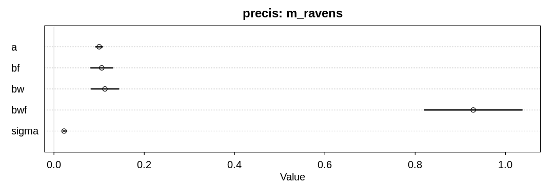
8M3. In parts of North America, ravens depend upon wolves for their food. This is because ravens are carnivorous but cannot usually kill or open carcasses of prey. Wolves however can and do kill and tear open animals, and they tolerate ravens co-feeding at their kills. This species relationship is generally described as a “species interaction.” Can you invent a hypothetical set of data on raven population size in which this relationship would manifest as a statistical interaction? Do you think the biological interaction could be linear? Why or why not?
Answer. Imagine the raven population is driven by both the wolf population and the general amount of food in the area. If there’s no food, more wolves traveling through the area won’t help the raven population. If there aren’t any wolves, there won’t be any open carcasses for the ravens to consume.
The regression equation:
Assume F and W are both non-negative indicators of the number of wolf prey and wolves, scaled by the maximum observed value.
It seems unlikely the interaction would be linear. Doubling the number of wolves with a set amount of food once would likely have more of an effect on the raven population than doubling it again with the same amount of food.
set.seed(24071847)

alpha = 0.1
beta_F = 0.1
beta_W = 0.1
beta_WF = 1.0

n_obs <- 100
food1 <- rexp(n_obs)
food <- food1 / max(food1)
wolves1 <- rexp(n_obs)
wolves <- wolves1 / max(wolves1)
mu <- alpha + beta_F*food + beta_W*wolves + beta_WF*food*wolves
ravens <- rnorm(n_obs, mean=mu, sd=0.02)

raven_df <- data.frame(food=food, wolves=wolves, ravens=ravens)

m_ravens <- quap(
  alist(
    ravens ~ dnorm(mu, sigma),
    mu <- a + bf * food + bw * wolves + bwf * food * wolves,
    a ~ dnorm(0.1, 1.0),
    bf ~ dnorm(0.1, 1.0),
    bw ~ dnorm(0.1, 1.0),
    bwf ~ dnorm(0.1, 1.0),
    sigma ~ dexp(1)
  ),
  data = raven_df
)

display_markdown("Sanity check of a model fit to the hypothetical data:")
iplot(function() {
  plot(precis(m_ravens, depth=3), main="precis: m_ravens")
}, ar=3)
Sanity check of a model fit to the hypothetical data:
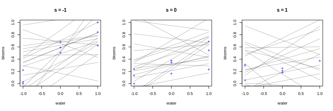
8M4. Repeat the tulips analysis, but this time use priors that constrain the effect of water to be positive and the effect of shade to be negative. Use prior predictive simulation. What do these prior assumptions mean for the interaction prior, if anything?
Answer. Changing our prior for the main effect of water and the main effect of shade does not necessarily imply a change to the interaction prior, unless we have some requirement or prior knowledge for how the priors should relate to each other.
The text previously chose to suppose the interaction prior should be strong enough to cancel the main effect of water. If we’re assuming the main effect of water is greater than before (when both mean and variance are considered), perhaps the new main effect of water prior implies we should increase the magnitude of the interaction prior to be cancel it, not necessarily changing its mean.
There is no right or wrong prior for the interaction effect, unless you have prior knowledge about e.g. how the association between blooms and water depends on shade. I’d argue (the text is not clear about this) that we do have common sense knowledge that this association decreases with greater shade, implying \(\beta_{WS}\) should be negative. This is despite our previous choice to keep it centered at zero, and not related to the change in the other priors.
source("load-tulip-models.R")

m_tulips <- quap(
  alist(
    blooms_std ~ dnorm(mu, sigma),
    mu <- a + bw * water_cent + bs * shade_cent + bws * water_cent * shade_cent,
    a ~ dnorm(0.5, 0.25),
    bw ~ dnorm(0.1, 0.2),
    bs ~ dnorm(-0.1, 0.2),
    bws ~ dnorm(-0.1, 0.2),
    sigma ~ dexp(1)
  ),
  data = d
)
iplot(function() {
  par(mfrow = c(1, 3)) # 3 plots in 1 row
  for (s in -1:1) {
    idx <- which(d$shade_cent == s)
    plot(d$water_cent[idx], d$blooms_std[idx],
      xlim = c(-1, 1), ylim = c(0, 1),
      xlab = "water", ylab = "blooms", pch = 16, col = rangi2
    )
    prior <- extract.prior(m_tulips)
    mu <- link(m_tulips, post=prior, data = data.frame(shade_cent = s, water_cent = -1:1))
    for (i in 1:20) lines(-1:1, mu[i, ], col = col.alpha("black", 0.3))
    title(paste("s =", s))
  }
}, ar=3.0)
8H1. Return to the data(tulips) example in the chapter. Now include the bed variable as a predictor in the interaction model. Don’t interact bed with the other predictors; just include it as a main effect. Note that bed is categorical. So to use it properly, you will need to either construct dummy variables or rather an index variable, as explained in Chapter 5.
d$bed_id <- as.integer(d$bed)
m_bed <- quap(
  alist(
    blooms_std ~ dnorm(mu, sigma),
    mu <- a[bed_id] + bw * water_cent + bs * shade_cent + bws * water_cent * shade_cent,
    a[bed_id] ~ dnorm(0.5, 0.25),
    bw ~ dnorm(0.1, 0.2),
    bs ~ dnorm(-0.1, 0.2),
    bws ~ dnorm(-0.1, 0.2),
    sigma ~ dexp(1)
  ),
  data = d
)
iplot(function() {
  plot(precis(m_bed, depth=3), main="precis: m_bed")
}, ar=3)
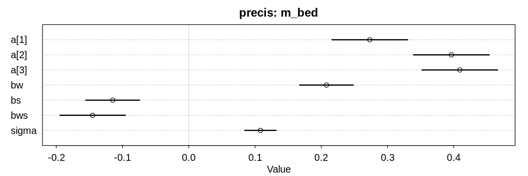
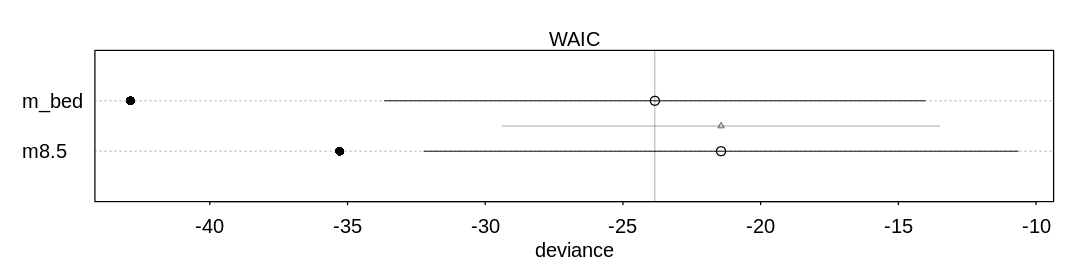
8H2. Use WAIC to compare the model from 8H1. to a model that omits bed. What do you infer from this comparison? Can you reconcile the WAIC results with the posterior distribution of the bed coefficients?
Answer. We can’t infer much from this comparison, because the two models are only marginally different in their predictive ability. Looking at both the posterior distribution of the bed coefficients (from the last answer) and these results, it may be that the first bed had some issues that made it produce fewer blooms. Still, this should probably be investigated further.
iplot(function() {
  plot(compare(m_bed, m8.5))
}, ar=4)
8H3. Consider again the data(rugged) data on economic development and terrain ruggedness,
examined in this chapter. One of the African countries in that example, Seychelles, is far outside
the cloud of other nations, being a rare country with both relatively high GDP and high ruggedness.
Seychelles is also unusual, in that it is a group of islands far from the coast of mainland Africa,
and its main economic activity is tourism.
(a) Focus on model m8.5 (sic) from the chapter. Use WAIC pointwise penalties and PSIS Pareto k
values to measure relative influence of each country. By these criteria, is Seychelles influencing
the results? Are there other nations that are relatively influential? If so, can you explain why?
ERROR: This question should refer to m8.3 rather than m8.5. See also the error on the ‘R
code 8.14’ box.
source("load-rugged-models.R")
PSIS_m8.3 <- PSIS(m8.3, pointwise=TRUE)
WAIC_m8.3 <- WAIC(m8.3, pointwise=TRUE)

display_markdown("**Answer.** A plot to help identify outliers:")
iplot(function() {
  plot(PSIS_m8.3$k, WAIC_m8.3$penalty,
       main="Ruggedness Outliers",
       xlab="PSIS Pareto k", ylab="WAIC penalty",
       col=rangi2, lwd=2)
}, ar=2)

display_markdown("Outliers where PSIS Pareto k > 0.4 or WAIC penalty > 0.4:")
rp_df = data.frame(psis_k=PSIS_m8.3$k, waic_penalty=WAIC_m8.3$penalty, country=dd$country)
display(rp_df[rp_df$psis_k > 0.4 | rp_df$waic_penalty > 0.4,])
Some Pareto k values are high (>0.5). Set pointwise=TRUE to inspect individual points.
Answer. A plot to help identify outliers:
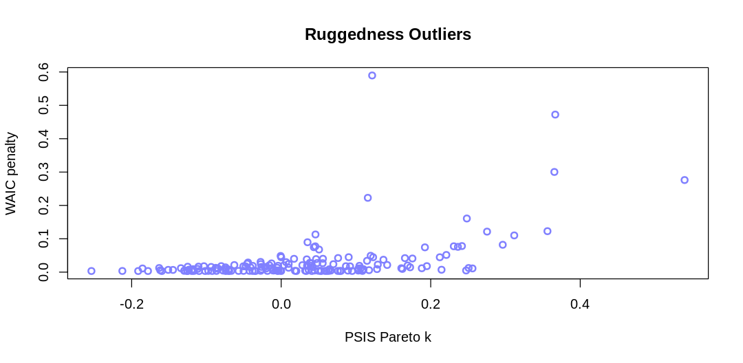
Outliers where PSIS Pareto k > 0.4 or WAIC penalty > 0.4:
| psis_k | waic_penalty | country | |
|---|---|---|---|
| <dbl> | <dbl> | <fct> | |
| 27 | 0.3665799 | 0.4723296 | Switzerland |
| 93 | 0.5395906 | 0.2760879 | Lesotho |
| 145 | 0.1216649 | 0.5895652 | Seychelles |
Switzerland is likely an outlier because it is in central Europe surrounded by affluent countries. It’s not as clear why Lesotho is an outlier; similar to Switzerland it may gain an advantage from being able to rely on the surrounding states (or state) for services such as defense.
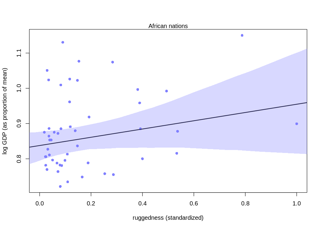
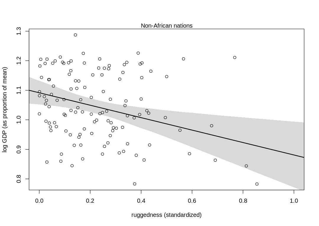
(b) Now use robust regression, as described in the previous chapter. Modify m8.5 (sic) to use a
Student-t distribution with \(\nu = 2\). Does this change the results in a substantial way?
Answer. Compare these plots to those in chapter. The model has picked up more from the data, increasing the association between log GDP and ruggedness (especially in non-African nations). In general, though, the results haven’t changed in a material way.
m_rugged_student <- quap(
  alist(
    log_gdp_std ~ dstudent(2, mu, sigma),
    mu <- a[cid] + b[cid] * (rugged_std - 0.215),
    a[cid] ~ dnorm(1, 0.1),
    b[cid] ~ dnorm(0, 0.3),
    sigma ~ dexp(1)
  ),
  data = dd
)

rugged_seq <- seq(from = -0.1, to = 1.1, length.out = 30)
d.A1 <- dd[dd$cid == 1, ]
mu <- link(m_rugged_student, data = data.frame(cid = 1, rugged_std = rugged_seq))
mu_mean <- apply(mu, 2, mean)
mu_ci <- apply(mu, 2, PI, prob = 0.97)

iplot(function() {
  plot(d.A1$rugged_std, d.A1$log_gdp_std,
    pch = 16, col = rangi2,
    xlab = "ruggedness (standardized)", ylab = "log GDP (as proportion of mean)",
    xlim = c(0, 1)
  )
  lines(rugged_seq, mu_mean, lwd = 2)
  shade(mu_ci, rugged_seq, col = col.alpha(rangi2, 0.3))
  mtext("African nations")
})

# plot non-Africa - cid=2
d.A0 <- dd[dd$cid == 2, ]
mu <- link(m_rugged_student, data = data.frame(cid = 2, rugged_std = rugged_seq))
mu_mean <- apply(mu, 2, mean)
mu_ci <- apply(mu, 2, PI, prob = 0.97)

iplot(function() {
  plot(d.A0$rugged_std, d.A0$log_gdp_std,
    pch = 1, col = "black",
    xlab = "ruggedness (standardized)", ylab = "log GDP (as proportion of mean)",
    xlim = c(0, 1)
  )
  lines(rugged_seq, mu_mean, lwd = 2)
  shade(mu_ci, rugged_seq)
  mtext("Non-African nations")
})
8H4. The values in data(nettle) are data on language diversity in 74 nations. The meaning of
each column is given below.
country: Name of the countrynum.lang: Number of recognized languages spokenarea: Area in square kilometersk.pop: Population, in thousandsnum.stations: Number of weather stations that provided data for the next two columnsmean.growing.season: Average length of growing season, in monthssd.growing.season: Standard deviation of length of growing season, in months
Use these data to evaluate the hypothesis that language diversity is partly a product of food security. The notion is that, in productive ecologies, people don’t need large social networks to buffer them against risk of food shortfalls. This means cultural groups can be smaller and more self-sufficient, leading to more languages per capita. Use the number of languages per capita as the outcome:
d$lang.per.cap <- d$num.lang / d$k.pop
Use the logarithm of this new variable as your regression outcome. (A count model would be better
here, but you’ll learn those later, in Chapter 11.) This problem is open ended, allowing you to
decide how you address the hypotheses and the uncertain advice the modeling provides. If you think
you need to use WAIC anyplace, please do. If you think you need certain priors, argue for them. If
you think you need to plot predictions in a certain way, please do. Just try to honestly evaluate
the main effects of both mean.growing.season and sd.growing.season, as well as their two-way
interaction. Here are three parts to help.
(a) Evaluate the hypothesis that language diversity, as measured by log(lang.per.cap), is
positively associated with the average length of the growing season, mean.growing.season. Consider
log(area) in your regression(s) as a covariate (not an interaction). Interpret your results.
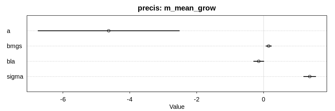
Answer. For the \(\beta_{mean.growing.season}\) prior assume the maximum possible influence occurs with the maximum growing season of 12 months, and this can increase the language diversity from its minimum to maximum (it has a range of about 9).
For the \(\beta_{log.area}\) prior, assume again the range of the output (9) can be completely covered by the range of the input (in this case, about 16 rather than 12).
data(nettle)
ndf <- nettle

## R code 8.27
ndf$lang.per.cap <- ndf$num.lang / ndf$k.pop
ndf$log.lang.per.cap <- log(ndf$lang.per.cap)
ndf$log.area <- log(ndf$area)

m_mean_grow <- quap(
  alist(
    log.lang.per.cap <- dnorm(mu, sigma),
    mu <- a + bmgs * mean.growing.season + bla * log.area,
    a <- dnorm(-5, 2),
    bmgs <- dnorm(0, 0.5*9/12),
    bla <- dnorm(0, 0.5*9/16),
    sigma <- dexp(1)
  ),
  data = ndf
)
We include log.area in the regression so we also condition on it. Language diversity per capita is
also associated with a country’s area, presumably because simply being a country makes it more
likely everyone within the country will speak the same language (A language is a dialect with an
army and navy), that is, there is lower language diversity in a large country.
Notice the area variable does not reflect population density in any way, which would presumably
influence language diversity. We could calculate population density with the area and k.pop
columns, but it’s not clear offhand what we would expect its influence would be. Would greater
population density simple be a reflection of growing season length? Would language diversity
decrease because of larger social networks?
The model supports the hypothesis that language diversity increases with the length of the growing season, though not strongly.
iplot(function() {
  plot(precis(m_mean_grow), main="precis: m_mean_grow")
}, ar=3)
(b) Now evaluate the hypothesis that language diversity is negatively associated with the standard
deviation of length of growing season, sd.growing.season. This hypothesis follows from uncertainty
in harvest favoring social insurance through larger social networks and therefore fewer languages.
Again, consider log(area) as a covariate (not an interaction). Interpret your results.
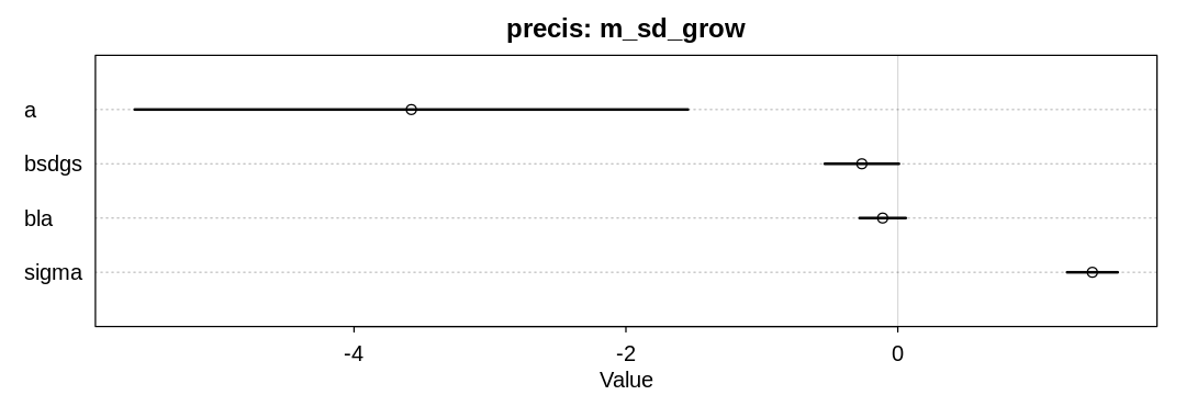
Answer. For the \(\beta_{sd.growing.season}\) prior, assume again the range of the output (~9) can be completely covered by the range of the input (~6).
m_sd_grow <- quap(
  alist(
    log.lang.per.cap <- dnorm(mu, sigma),
    mu <- a + bsdgs * sd.growing.season + bla * log.area,
    a <- dnorm(-5, 2),
    bsdgs <- dnorm(0, 0.5*9/6),
    bla <- dnorm(0, 0.5*9/16),
    sigma <- dexp(1)
  ),
  data = ndf
)
The model supports the hypothesis that language diversity decreases with variation in the length of the growing season.
iplot(function() {
  plot(precis(m_sd_grow), main="precis: m_sd_grow")
}, ar=3)
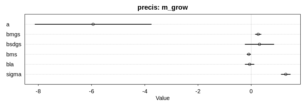
(c) Finally, evaluate the hypothesis that mean.growing.season and sd.growing.season interact to
synergistically reduce language diversity. The idea is that, in nations with longer average growing
seasons, high variance makes storage and redistribution even more important than it would be
otherwise. That way, people can cooperate to preserve and protect windfalls to be used during the
droughts.
m_grow <- quap(
  alist(
    log.lang.per.cap <- dnorm(mu, sigma),
    mu <- a + bmgs * mean.growing.season + bsdgs * sd.growing.season + bla * log.area + bms *
mean.growing.season * sd.growing.season,
    a <- dnorm(-5, 2),
    bmgs <- dnorm(0, 0.5*9/12),
    bsdgs <- dnorm(0, 0.5*9/6),
    bms <- dnorm(0, 1.0),
    bla <- dnorm(0, 0.5*9/16),
    sigma <- dexp(1)
  ),
  data = ndf
)
The model supports the hypothesis that language diversity decreases when both the mean and variance of the growing season increases, though not strongly. Unfortunately it seems to contradict the previous hypothesis that variance in the length of the growing season negatively affects language diversity.
iplot(function() {
  plot(precis(m_grow), main="precis: m_grow")
}, ar=3)
source("practice-model-interactions.R")
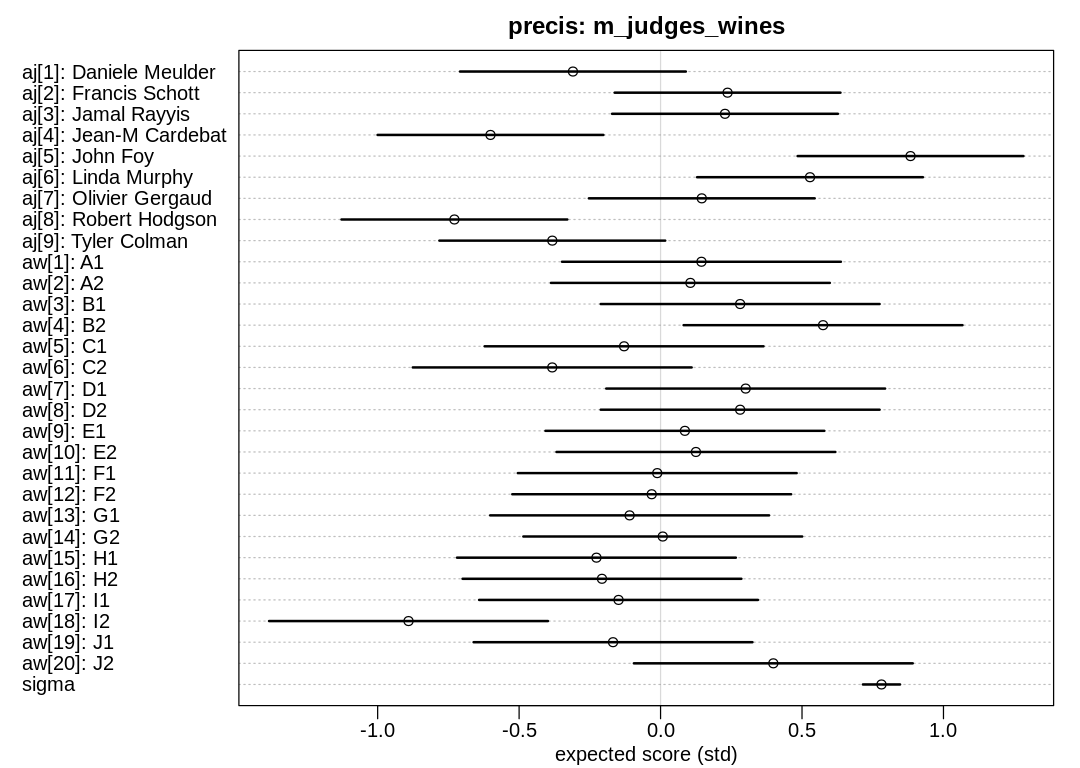
8H5. Consider the data(Wines2012) data table. These data are expert ratings of 20 different
French and American wines by 9 different French and American judges. Your goal is to model score,
the subjective rating assigned by each judge to each wine. I recommend standardizing it. In this
problem, consider only variation among judges and wines. Construct index variables of judge and
wine and then use these index variables to construct a linear regression model. Justify your
priors. You should end up with 9 judge parameters and 20 wine parameters. How do you interpret the
variation among individual judges and individual wines? Do you notice any patterns, just by plotting
the differences? Which judges gave the highest/lowest ratings? Which wines were rated worst/best on
average?
Answer. Because we’ve centered and scaled score, both the aj and aw priors are also
centered at zero with a standard deviation of one. About 95% of the range of the output is within
two standard deviations of the mean, and since SD=1, we want to cover an absolute output range of
about 4. To allow selecting a wine or judge to select any score in this most probable output range,
we allow the intercepts to sit anywhere in this most probable output range.
John Foy gave the highest scores; Robert Hodgson gave the lowest. The white wine B2 got the highest scores and the red wine I2 got the lowest.
8H6. Now consider three features of the wines and judges:
flight: Whether the wine is red or white.wine.amer: Indicator variable for American wines.judge.amer: Indicator variable for American judges.
Use indicator or index variables to model the influence of these features on the scores. Omit the individual judge and wine index variables from Problem 1. Do not include interaction effects yet. Again justify your priors. What do you conclude about the differences among the wines and judges? Try to relate the results to the inferences in the previous problem.
Answer. Priors were selected as in the previous problem, to cover the range of the output.
There is minor support for the hypothesis that American judges slightly prefer American wines, or that French judges slightly prefer French wines. There is also minor support for the hypothesis that French wines generally do better, suggesting the French judges prefer French wines.
John Foy and Linda Murphy gave the highest scores and were also American, so the bias may be coming from their general optimism if they also preferred American wines. The highest scoring wines (B2 and J2) were both French, and the lowest scoring was American (I2) so it may come down to individual wines as well.
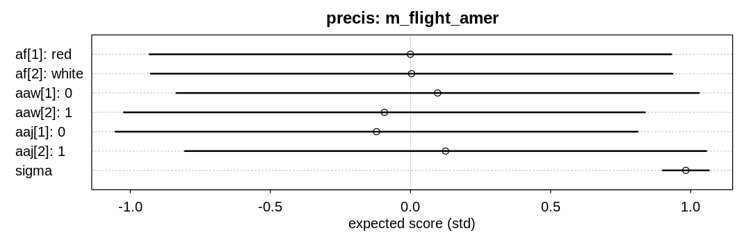
8H7. Now consider two-way interactions among the three features. You should end up with three
different interaction terms in your model. These will be easier to build, if you use indicator
variables. Again justify your priors. Explain what each interaction means. Be sure to interpret the
model’s predictions on the outcome scale (mu, the expected score), not on the scale of individual
parameters. You can use link to help with this, or just use your knowledge of the linear model
instead. What do you conclude about the features and the scores? Can you relate the results of your
model(s) to the individual judge and wine inferences from 8H5?
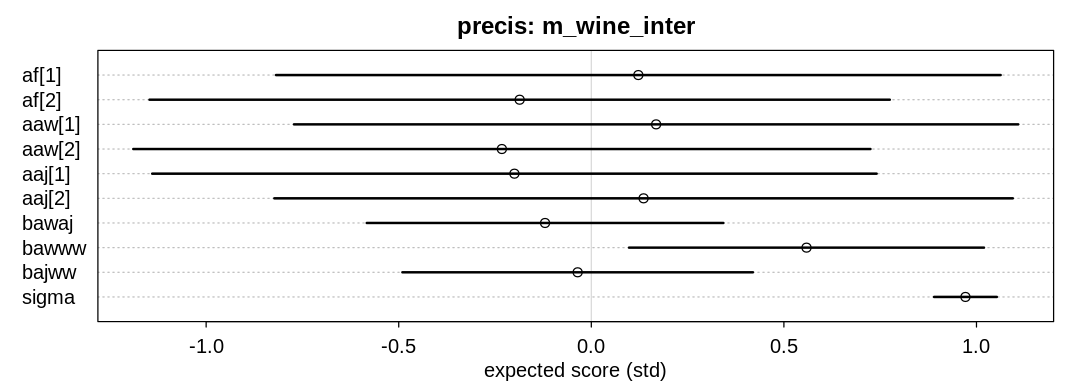
Answer. Because we’re using indicator variables for the interaction priors the interaction terms
represent the difference in the outcome when both indicators are true; for example when both judge
and wine are American. The other parameters, those starting with a in this case, will adjust to
allow this difference to be positive or negative as need be. To allow the interaction terms to cover
4 standard deviations or a range of 4 since |SD|=1 on the output scale, we need to allow these
priors to be greater in magnitude.
The term \(\beta_{american.wine.american.judge}\) represents the score increase when both the judge and wine are American; perhaps positive if American judges have a preference for American wines or French judges have a preference for French wine.
The term \(\beta_{american.wine.white.wine}\) represents the score increase when the wine is American and white; perhaps positive if American whites do particularly well.
The term \(\beta_{american.judge.white.wine}\) represents the score increase when the judge is American and the wine is white; perhaps positive if American judges have a preference towards white wine.
There is some support for the hypothesis that being both American and a white wine is associated with an extra boost in performance.
wines$wwi = wines$fid - 1
m_wine_inter <- quap(
  alist(
    score_std ~ dnorm(mu, sigma),
    mu ~ af[fid] + aaw[awid] + aaj[ajid] + bawaj * wine.amer * judge.amer + bawww * wwi * wine.amer + bajww * wwi* judge.amer,
    af[fid] ~ dnorm(0, 1),
    aaw[awid] ~ dnorm(0, 1),
    aaj[ajid] ~ dnorm(0, 1),
    bawaj ~ dnorm(0, 2),
    bawww ~ dnorm(0, 2),
    bajww ~ dnorm(0, 2),
    sigma ~ dexp(1)
  ),
  data = wines
)
iplot(function() {
  plot(
    precis(m_wine_inter, depth=2),
    main="precis: m_wine_inter",
    xlab="expected score (std)"
  )
}, ar=2.8)